All posts by rachjackson5
Evaluation Question Three
Evaluation Question Two
Evaluation Question One
My Finished Film Poster
Film Poster finishing Touches
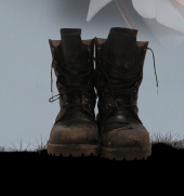
I have decided to use the fathers boots as the silhouette rather than a person. In the centre you can still see the detail but they are smaller and the boots look more effective when they are not floating near the film title.
This meant I had to move and edit the main title to fit across the top of the whole poster as there was a gap where the boots were originally going to be. I did not want to change the font size particularly but when the title was central the actors names could move down and inwards slightly drawing more attention to them.
when the actors names were moved it left space where the names were and conventionally I felt ‘coming soon’ would look good there as many posters have that there or a release date.
I always wanted the tagline to be in a different font to the main title and I was happy with the font I had chosen but it looked out of place next to the titles at the top of the poster. To solve this I reflected on the Saving Private Ryan poster and changed the font colour to white and moved it to the bottom of the poster near the billing block which made it stand out a lot more.
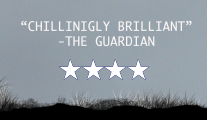
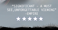
either sides of the boots is where I wanted the film reviews to go and this is how they looked:
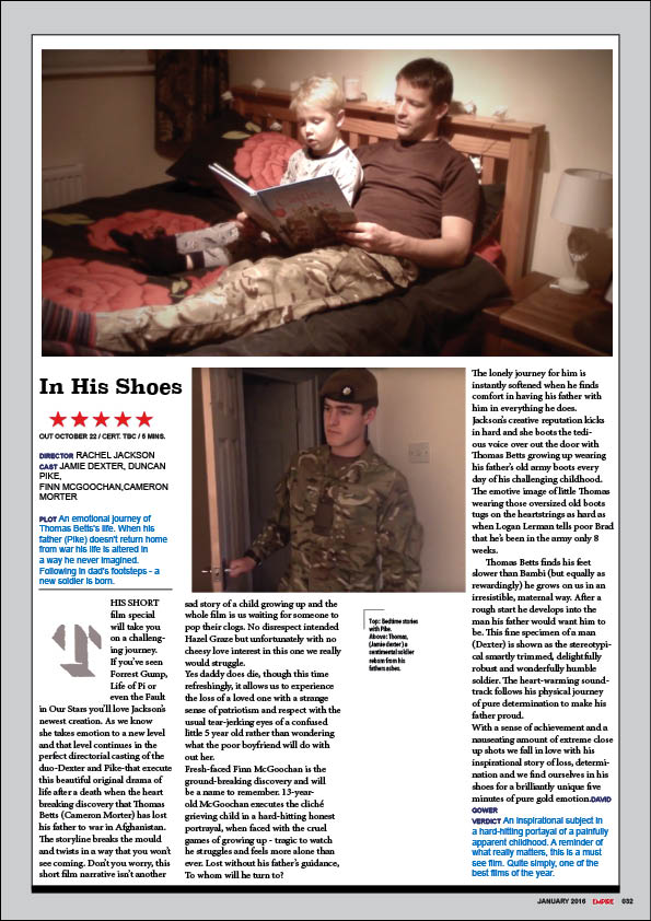
My Finished Film Review
My Finished Short Film
Film Poster Session 4
Actors Faces – Main Image:
I am using my four actors faces to make the main image on the poster. The original photos I took of my actors were all in different places but had them all looking forward with a serious expression.
I removed the backgrounds from the images with a ‘magic eraser tool’ on Photoshop and then changed the opacity of the layers making their faces look more transparent and this allowed the background grey sky to show through slightly setting the mood of the poster be more reflecting of the genre and film.
Because I cast all my actors to look similar it shows all of their blue eyes and suggests the relations as well as the difference in age as from right to left they grow older. All of their faces were on the same opacity of 50% however due to the difference in lighting I had to modify each of them separately. Their shoulders blended well into each other as I changed the hardness and brush size of the rubber to give a more rounded edge allowing them to blend into each other.
Short Film – Second Edit
Review and feedback:
- The title transition is very effective and conventional.
- The memories are very emotive.
- The music shows how the audience to feel and it is nice that there is vocals at times as well as the instrumental build.
- The actors are well cast as they do look similar and the change of actor is clearly the protagonist growing up.
- The pace of the film is successfully conventional.
Improvements:
- There needs to be a shot added showing the father leaving home and going to war after he returns home to clarify why the son is waiting on the stairs.
- There are certain points where the ambient sound is too loud.
- There needs to be more layers of sound when the boy sees his father in the runners face.
- The ‘Thanks Dad’ dialogue is slightly out of time with the visual this needs changing.
- The Blur effect needs increasing on the corners of the memory shots.
- The film title needs to come in slightly slower.


